Tip 1: Use High-Contrast Fonts That Print Clearly
The number-one design mistake is using light or decorative fonts that look great on screen but disappear when printed on a budget home printer.
**Fonts that sell:** Bold sans-serif fonts for headings (Arial Black, Montserrat Bold, Poppins SemiBold). Clean sans-serif for body text (Open Sans, Lato, Roboto). Minimum 14pt for body text, 20pt+ for headings.
**Fonts that hurt sales:** Script fonts (except for decorative titles), thin-weight fonts, fonts with fine detail that fills in when printed. Comic Sans is polarizing — avoid it.
Always test print your worksheet in black and white. Many parents print in grayscale to save ink. If your text is not clearly readable in grayscale, redesign the layout. This single test catches 80% of readability issues.
Tip 2: Leave 40% White Space on Every Page
Crowded worksheets overwhelm children and frustrate parents. The best-selling worksheets have noticeably more white space than average ones.
**The 40% rule:** At least 40% of the page should be empty — margins, spacing between problems, room for writing answers. This feels counterintuitive because more content seems like more value. But parents pay for usability, not density.
**Practical spacing guidelines:**
- 0.5-inch margins minimum (0.75 inches is better)
- 1.5x line spacing between problems
- Answer boxes at least 0.5 inches tall for handwriting
- Group related items with visible spacing between groups
Worksheets from a generator typically handle spacing automatically, but if you are compiling custom bundles, pay attention to this. One overcrowded page in a 50-page bundle can trigger a negative review.
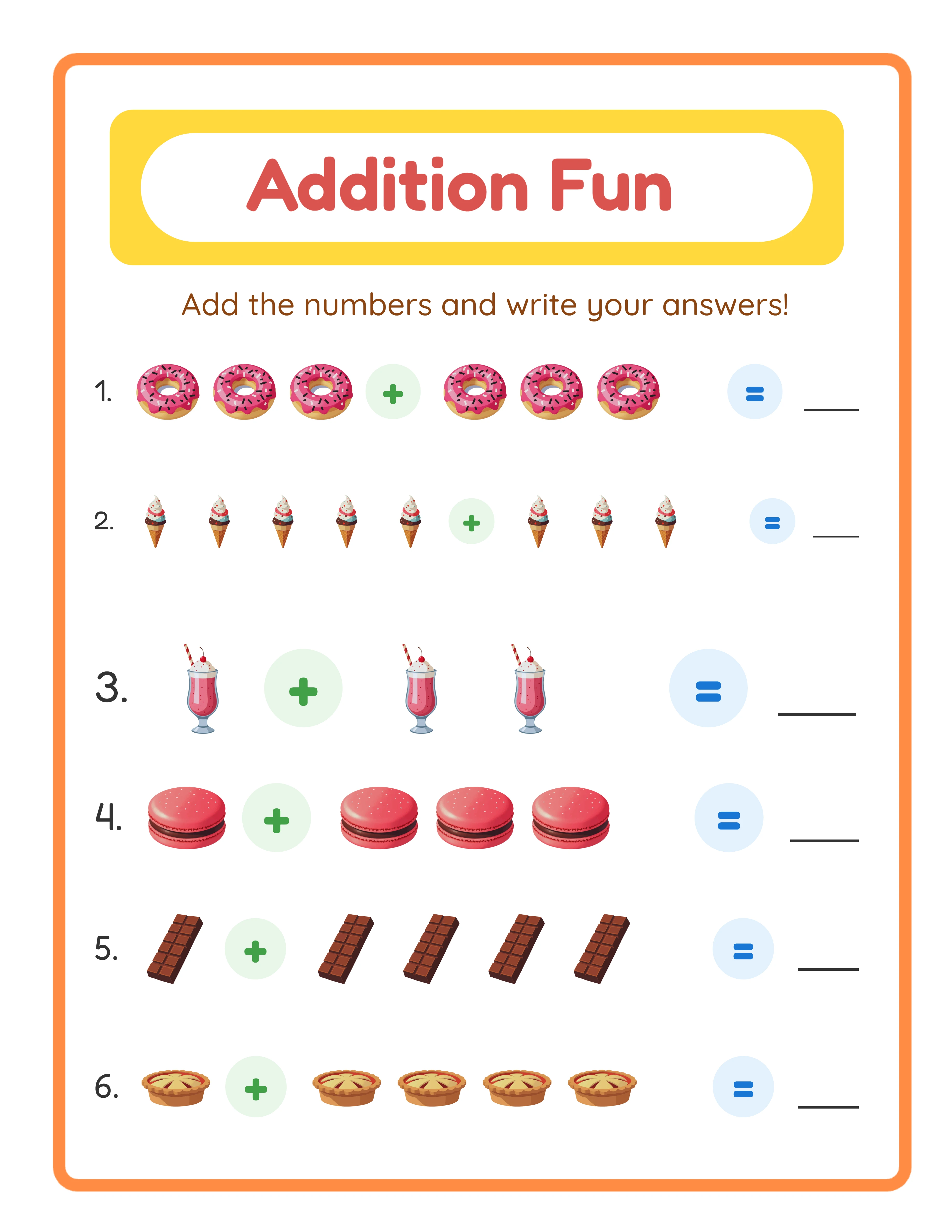
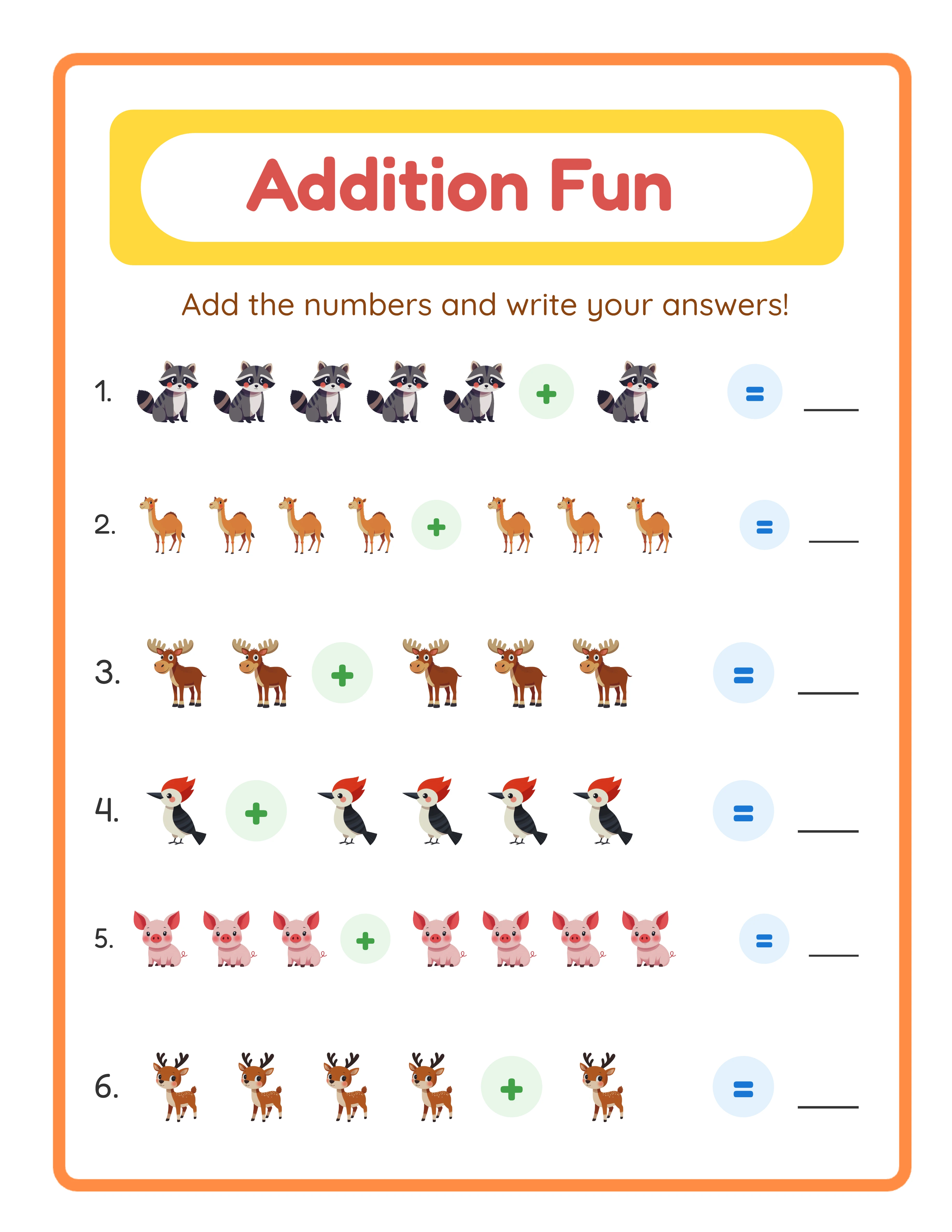
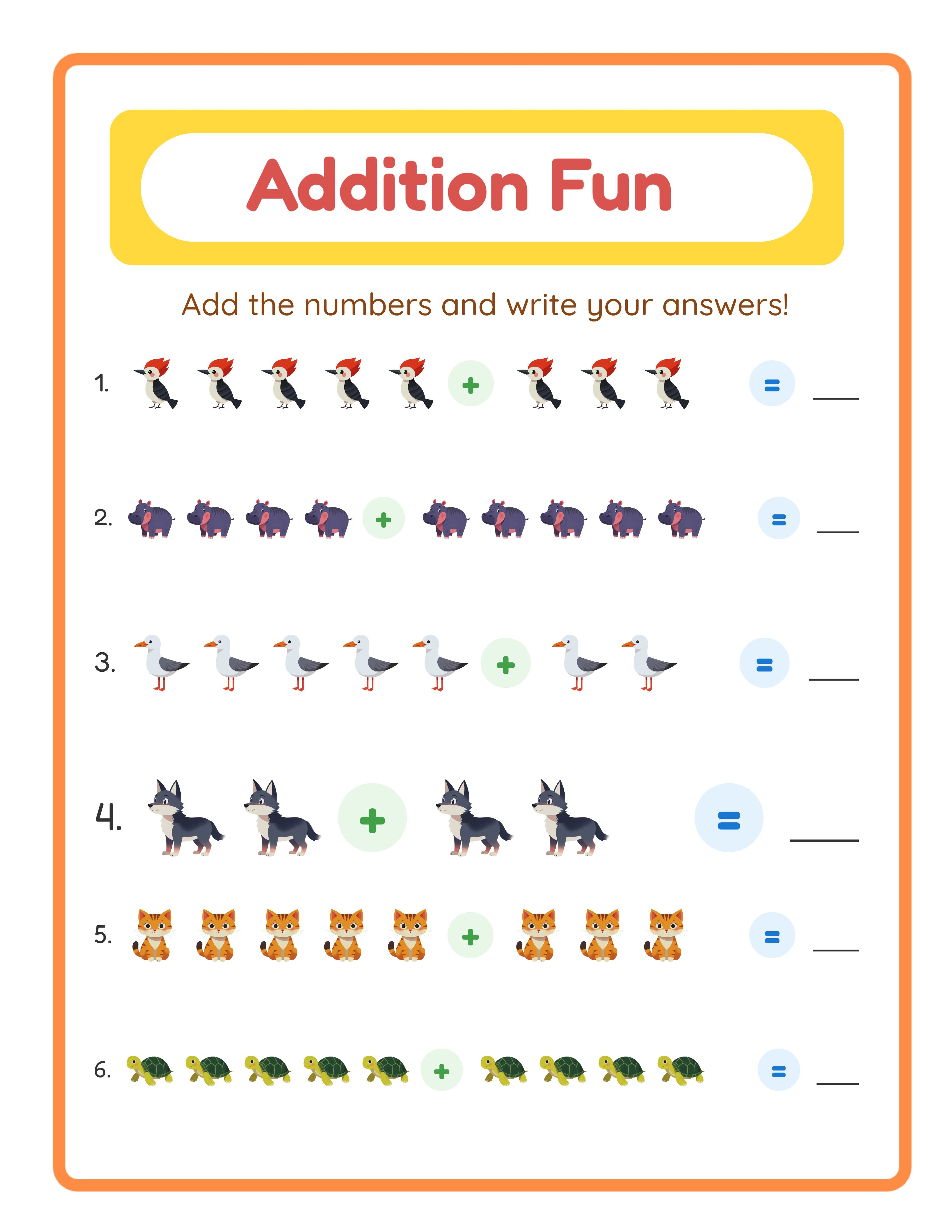
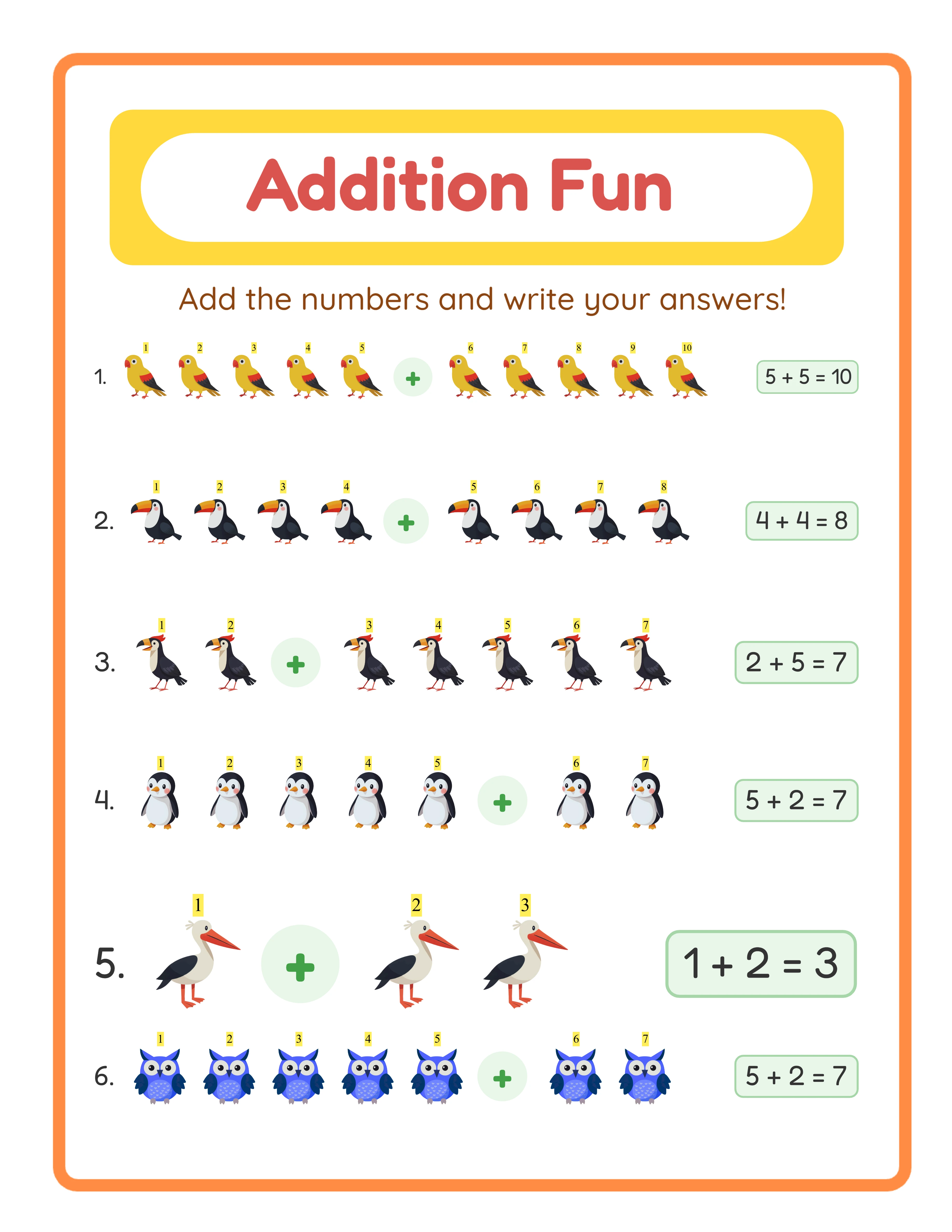
Tip 3: Add Themed Images That Match the Activity
Worksheets with themed images sell 2-3x better than plain text-only versions. This is the single biggest differentiator in the math worksheet niche.
**Why images work:** They make listing thumbnails eye-catching, they engage children during the activity, and they justify higher pricing. A plain addition worksheet competes at $1.50. An animal-themed addition worksheet with cute illustrations competes at $3.99-$4.99.
**Image placement rules:**
- One large image per section or 2-3 smaller images spread across the page
- Images should relate to the problems (counting animals, coloring themed pictures)
- Keep images above or beside the work area, never overlapping answer spaces
- Use consistent image style throughout a bundle — mixing clip-art styles looks unprofessional
LessonCraftStudio's generators include 100+ themed image sets that are automatically placed alongside worksheet content. This handles image integration without separate clip-art purchases or manual layout work.
Every Worksheet Includes an Answer Key
Tip 4: Design for the Listing Thumbnail First
Your worksheet appears as a tiny thumbnail in Etsy search results — roughly 250 x 200 pixels. If the design is not recognizable at that size, buyers will not click.
**Thumbnail-first design principles:**
- Use bold, saturated colors for borders and headers (not pastels)
- Include one large focal element visible at thumbnail size
- Add a colored banner or sidebar — it creates visual structure even at small sizes
- Avoid fine detail that becomes muddy when shrunk
**Test your thumbnail:** Shrink your worksheet image to 250 pixels wide on your monitor. Can you tell what it is? Can you see the theme? If not, simplify the design.
The most successful sellers design their worksheets knowing the listing photo matters more than the print experience. This sounds backwards, but a worksheet that nobody clicks on never gets printed. Prioritize visual impact at thumbnail scale, then ensure print quality is solid.
Tips 5-8: Quick Wins for Immediate Improvement
**Tip 5: Include Answer Keys on Colored Paper.** Print your answer keys on a light colored background (pale yellow, light blue). This visually separates them from worksheets and makes your bundle feel more organized. Buyers notice this detail in listing previews.
**Tip 6: Add Page Numbers and Headers.** Every page should have a header with the worksheet name and a page number. This costs zero extra effort but makes your product feel professional. "Addition Practice — Page 7 of 50" tells buyers exactly where they are.
**Tip 7: Use a Consistent Color Palette.** Pick 3-4 colors and use them throughout the entire bundle. Random color changes between pages look disjointed. A consistent palette creates brand recognition when buyers see your products in search results.
**Tip 8: Create a Cover Page That Sells the Bundle.** Your first page should be a visually appealing cover — not another worksheet. Include the title, theme, page count, age range, and a preview of the activity types inside. This cover becomes your primary listing photo and sets buyer expectations correctly.
Each of these tips takes under a minute to implement per product but cumulatively they transform amateur-looking worksheets into professional products that command premium pricing.