Tutorial
1
Understanding the Three Progressive Writing Modes
The writing generator offers three distinct modes that create a natural learning progression. Understanding how each mode works is essential for building a handwriting book that genuinely teaches letter formation.
Mode 1 -- Trace: The generator produces dotted letter outlines on guided lines. The child places their pencil on the starting dot and traces along the dotted path. Arrow indicators show stroke direction and sequence. This mode is the entry point for children who have never written letters before.
What makes tracing effective: The dotted outlines constrain the child's pencil to the correct path. Errors are self-evident -- if the pencil strays from the dots, the child sees the deviation immediately. Repeated tracing builds muscle memory for correct letter shapes.
Mode 2 -- Guided: The generator produces a model letter at the start of the line, followed by writing guidelines (top line, middle dotted line, bottom line) without dotted outlines. The child studies the model letter, then reproduces it on the guided lines. Arrow stroke order indicators may appear on the model letter only.
What makes guided practice effective: The child must remember the letter shape while forming it. The guidelines provide spatial boundaries (how tall, how wide) but the actual stroke path comes from memory. This bridges the gap between tracing and free writing.
Mode 3 -- Independent: The generator produces a small model letter in a reference box, followed by blank lined space (or lightly ruled space) where the child writes the letter multiple times without any guides beyond the lines.
What makes independent practice effective: The child demonstrates genuine mastery. They recall the letter shape, control their pencil to form it correctly, and maintain consistent sizing across multiple repetitions. This is the competence level parents want their children to achieve.
For a handwriting book, arrange pages in mode order: all tracing pages first, then guided pages, then independent pages. Alternatively, arrange by letter -- each letter gets one tracing page, one guided page, and one independent page before moving to the next letter.
2
Choosing Font Styles for Curriculum Alignment
The 5 font options in the writing generator correspond to different handwriting instruction methodologies used in schools. Choosing the right font dramatically affects which buyers purchase your book.
Font analysis and target audience:
Font 1 -- Standard manuscript (ball-and-stick): Letters formed with circles and straight lines. The simplest style for beginners. Most common in early preschool and homeschool settings. Target audience: parents of children ages 3 to 5 who are learning their first letters.
Font 2 -- D'Nealian style: Letters with slight curves at the baseline that prepare children for cursive transitions. Used in many US school districts. Target audience: kindergarten and first grade parents/teachers in D'Nealian schools.
Font 3 -- Zaner-Bloser style: Clean vertical letters without cursive preparation strokes. The most widely used manuscript style in US schools. Target audience: kindergarten and first grade parents/teachers in Zaner-Bloser schools.
Font 4 -- Modern manuscript: A contemporary style with gentle curves. Popular in newer curriculum adoptions. Target audience: progressive schools and homeschool families seeking current standards.
Font 5 -- Rounded style: Softer letter shapes with rounded terminals. Visually appealing and easier for very young children to trace. Target audience: preschool and pre-K programs.
Publishing strategy: Create separate handwriting books for each font style. "Handwriting Practice Book -- D'Nealian Style" and "Handwriting Practice Book -- Zaner-Bloser Style" are different products targeting different buyers. Parents and teachers search specifically for their school's handwriting style.
In your Amazon listing, explicitly name the handwriting style. Teachers will not purchase a book unless they can verify it matches their classroom instruction method. Include the font style in the title or subtitle for maximum search visibility.
3
Designing the Letter Progression Sequence
The order in which you present letters matters pedagogically and commercially. A book that starts with the letter A and proceeds to Z follows alphabetical order -- but this is not the most effective teaching sequence.
Developmental letter progression (recommended for ages 3 to 5):
Group 1 -- Straight-line letters: L, T, I, H, E, F, X
These letters require only vertical and horizontal strokes. They are the easiest to form correctly and build confidence in beginning writers.
Group 2 -- Circle and curve letters: O, C, S, U, Q
These letters introduce curved strokes. The full circle (O) is the most natural curve motion. Partial curves (C, S, U) follow.
Group 3 -- Combination letters: D, B, P, R, G, J
These letters combine straight lines with curves. They require the child to change stroke type mid-letter, which is a significant motor coordination challenge.
Group 4 -- Diagonal letters: A, V, W, M, N, K, Y, Z
Diagonal strokes are the most difficult for young children because they require coordinated hand movement at an angle. Save these for the end of the progression.
Alternative: Alphabetical order (recommended for ages 5 to 7):
For kindergarten and first grade workbooks, alphabetical order (A through Z) is acceptable because children at this age already have basic motor control. Parents and teachers expect alphabetical order in school-age workbooks and may question a developmental sequence they do not recognize.
Choose your progression based on your target age. For preschool handwriting books, use the developmental sequence. For kindergarten and up, use alphabetical order. Clearly state which approach you use in the book's introduction page -- this demonstrates pedagogical intentionality that parents and teachers value.
4
Generating Letter Practice Pages with Stroke Order
Open the writing generator and configure it for your handwriting book. Here is the optimal setup for each age group.
Preschool letter tracing (ages 3 to 5):
- Font: Standard manuscript or rounded style
- Mode: Tracing (Mode 1) for the primary section
- Letter size: Large (filling most of the writing area)
- Lines per page: 3 to 4 practice lines per letter
- Stroke arrows: Enabled (shows starting point and direction for each stroke)
- Letters per page: 1 letter per page (uppercase only)
Kindergarten handwriting (ages 5 to 6):
- Font: D'Nealian or Zaner-Bloser (match target school district)
- Mode: All three modes -- trace, guided, independent
- Letter size: Medium (standard primary writing paper proportions)
- Lines per page: 4 to 6 practice lines per letter
- Stroke arrows: Enabled on tracing and first guided line
- Letters per page: 1 letter per page (uppercase and lowercase together)
First grade handwriting (ages 6 to 7):
- Font: Match the school's adopted style
- Mode: Guided and independent (less tracing needed at this level)
- Letter size: Standard (closer to standard writing paper proportions)
- Lines per page: 6 to 8 practice lines per letter
- Stroke arrows: On model letter only
- Letters per page: 1 to 2 letters per page (uppercase and lowercase)
For each letter, generate pages in all three modes. A complete uppercase alphabet in three modes produces 78 pages (26 letters multiplied by 3 modes). Add lowercase versions and you reach 156 pages -- a substantial book.
Export each page as a 300 DPI PDF. The generator produces print-ready pages with proper line spacing, consistent letter sizing, and clean stroke order arrows. Verify each page before adding it to your manuscript compilation.
5
Adding Word and Sentence Tracing Practice
Letters alone do not make a complete handwriting book. Buyers expect a progression from individual letters to words, and ideally to simple sentences. This progression demonstrates genuine skill building and adds perceived value.
Word tracing progression:
Level 1 -- Two and three-letter words: After children complete individual letter practice, introduce simple words. CVC (consonant-vowel-consonant) words are ideal: cat, dog, sun, big, red, hat, cup, bus. Generate tracing pages with these words using the same font style as the letter pages.
Level 2 -- Four and five-letter words: tree, fish, bird, star, moon, hand, book, cake. These words introduce letter combinations that require smooth transitions between strokes.
Level 3 -- Common sight words: the, and, was, you, are, his, her, they, were, said. Sight words are particularly valuable because they align with kindergarten and first grade reading curricula. Parents and teachers actively search for "sight word handwriting practice."
Level 4 -- Simple phrases and sentences: "The cat sat." "I can run." "My dog is big." These short sentences integrate individual letter skills into connected writing. Include 5 to 10 sentence tracing pages at the end of the book.
Themed word integration:
Use vocabulary from the same themed image collections used across other generators. An animal-themed handwriting book uses animal words for tracing practice: cat, dog, pig, cow, hen, fox, bat, owl. Include a small themed image next to each word for visual context.
Page layout for word practice:
- Model word at the top of the line (in the book's font style)
- 3 to 4 dotted tracing repetitions of the word
- 2 to 3 blank guided lines for independent writing of the word
- Small themed image in the margin for visual reference
Include 15 to 25 word practice pages and 5 to 10 sentence pages. This transforms your book from "letter tracing" into "handwriting practice" -- a significant perceived value increase.
6
Structuring the Handwriting Book Manuscript
A professional handwriting book follows a clear structural logic that parents and teachers immediately understand when browsing "Look Inside" on Amazon.
Optimal manuscript structure:
Pages 1-2: Title page with book title, age range, and font style name
Pages 3-4: "For Parents and Teachers" introduction explaining the three-mode progression, the font style used, and how to guide children through the book
Pages 5-6: Visual guide showing correct pencil grip, paper positioning, and posture
Section 1 -- Uppercase Letter Tracing (pages 7-32):
- 26 pages, one letter per page
- Tracing mode with dotted outlines and stroke order arrows
- 4 to 6 practice lines per letter
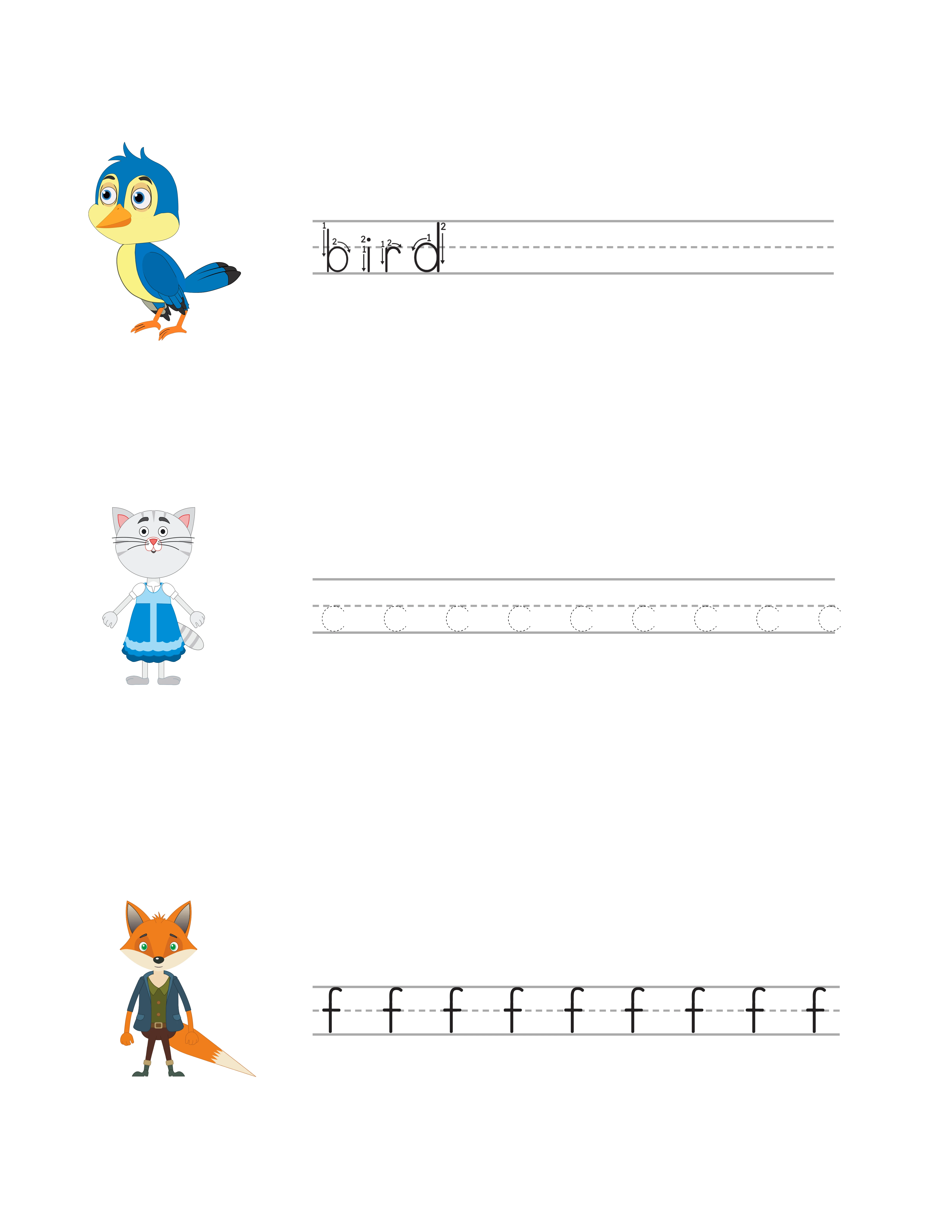
- Each page shows the letter, a stroke order diagram, and a small themed image whose name starts with that letter (A for Apple, B for Bird, etc.)
Section 2 -- Lowercase Letter Tracing (pages 33-58):
- 26 pages, one lowercase letter per page
- Same tracing format as uppercase
- Includes the uppercase version as a reference in the corner
Section 3 -- Guided Practice (pages 59-84):
- 26 pages combining uppercase and lowercase for each letter
- Model letters at the start of each line, guided lines for independent writing
- 5 to 6 practice lines per letter pair
Section 4 -- Word Practice (pages 85-104):
- 10 pages of 3-letter word tracing (CVC words)
- 5 pages of 4-5 letter word tracing
- 5 pages of sight word practice
Section 5 -- Sentence Practice (pages 105-112):
- 8 pages of simple sentence tracing and copying
- Progressive sentence length (3 words, then 4, then 5)
Pages 113-114: Independent writing pages (blank guided lines for free practice)
Pages 115-116: Certificate of completion
Pages 117-118: Catalog page showing other handwriting books in the series
Total: Approximately 118 pages. This supports a $7.99 to $8.99 price point.
Merge all individual PDFs into one manuscript. Verify consistent line spacing, font style, and page dimensions throughout. Set KDP interior to "black and white" with "no bleed."
7
Creating Uppercase and Lowercase Practice Variations
The relationship between uppercase and lowercase letters is a key teaching point in handwriting books. How you present this relationship affects both the pedagogical value and the commercial positioning of your book.
Approach 1 -- Separate sections (recommended for ages 3 to 5):
Teach all uppercase letters first, then all lowercase letters. Young children benefit from mastering one case before introducing the visual confusion of similar-looking letters (b/d, p/q, m/n).
Structure: 26 uppercase tracing pages, then 26 lowercase tracing pages. Each lowercase page includes a small uppercase reference.
Approach 2 -- Paired letters (recommended for ages 5 to 7):
Teach uppercase and lowercase versions of each letter on the same page or facing pages. This approach reinforces the connection between cases and is how most school curricula present letters.
Structure: 26 paired pages, each showing Aa, Bb, Cc with tracing for both versions.
Approach 3 -- All three on one page (compact format):
Show the uppercase, lowercase, and a word example on a single page. This dense format works for review books and older children.
Structure: 26 pages, each containing uppercase tracing, lowercase tracing, and one word example starting with that letter.
Publishing opportunity: Each approach is a separate product.
- "Uppercase Letter Tracing Book" (ages 2-4, 60 pages, $5.99)
- "Lowercase Letter Tracing Book" (ages 3-5, 60 pages, $5.99)
- "Complete Handwriting Workbook: Uppercase & Lowercase" (ages 4-6, 120 pages, $7.99)
Three products from one generation effort, each targeting different keywords and age groups.
For each approach, generate the pages using your chosen font style and export as individual PDFs. The writing generator handles letter sizing, line spacing, and stroke order guides automatically.
8
Leveraging Arrow Stroke Order for Competitive Advantage
Arrow stroke order guides are the single most important feature that differentiates professional handwriting books from amateur ones. Teachers and education-savvy parents specifically look for stroke order instruction -- it is mentioned in reviews as a key positive feature.
What stroke order means: Each letter is formed by a specific sequence of strokes. The letter "A," for example, starts with a diagonal stroke from top to bottom-left, then a diagonal from top to bottom-right, then a horizontal crossbar. Incorrect stroke order leads to malformed letters, inconsistent sizing, and difficulty transitioning to cursive writing later.
How the generator implements stroke order: Numbered arrows on the letter show where each stroke starts and which direction it moves. Arrow 1 shows the first stroke. Arrow 2 shows the second stroke. The starting point of each stroke is marked with a dot.
Stroke order placement in your book:
- On tracing pages: Full stroke order arrows on the model letter at the top of each page. Simplified directional arrows on the first tracing line.
- On guided pages: Stroke order arrows on the model letter only. The child references the model while writing on the practice lines.
- On independent pages: A small reference box in the corner with the stroke-ordered letter. The main practice area has no arrows.
This graduated removal of stroke order support mirrors how handwriting is taught in classrooms: explicit instruction, guided practice, then independent application.
Marketing the stroke order feature: Include "with stroke order guides" or "with arrow formation guides" in your title or subtitle. Show a close-up of a stroke-ordered letter in your Amazon listing images. This specific feature is a purchase trigger for teachers and education-focused parents.
In your book description, explain the stroke order methodology: "Each letter includes numbered arrow guides showing the correct starting point and stroke direction. Children learn proper letter formation from the first stroke, building habits that transfer to cursive writing."