Tutorial
1
Establish Resolution and File Format Standards for Print-Ready Worksheets
Resolution and file format are the foundation of print quality because they determine whether a worksheet prints sharply or appears blurry and pixelated. These technical standards must be set correctly at the beginning of the creation process because they cannot be effectively improved after the fact — upscaling a low-resolution file does not add detail, it simply enlarges existing pixels.
Set your working resolution to 300 DPI (dots per inch) as the minimum standard for all printable worksheets. This resolution produces sharp, professional output on both inkjet and laser home printers. Some sellers work at 150 DPI to reduce file sizes, but the quality difference is visible in printed output, particularly for text, fine lines, and detailed illustrations. The file size savings of lower resolution are not worth the quality reduction, especially since marketplace platforms can handle files up to 300 MB or more. If your worksheets contain photographic images, 300 DPI is essential — photos at lower resolutions show visible pixelation when printed at standard worksheet sizes.
PDF is the universal file format for printable worksheets. Buyers expect PDF files because they print consistently across operating systems and devices without formatting shifts. When exporting to PDF, use the PDF/A standard or high-quality print preset in your design software, which embeds fonts and preserves image quality. Never export worksheets as JPEG or PNG files for sale — these formats lose quality through compression, do not support multi-page documents, and may render differently on different devices. The only exception is if you are specifically selling individual images or clip art rather than printable worksheets.
For color mode, use RGB if your primary audience prints on home inkjet printers, which is the case for most educational printable buyers. CMYK is technically more accurate for professional commercial printing, but most home printers accept RGB input and convert internally, and CMYK files can appear duller when viewed on screen or printed on consumer devices. If you sell products specifically marketed for commercial or professional printing (poster sets, display materials intended for print shops), offer CMYK versions as an additional format alongside the standard RGB version.
Verify your resolution settings before beginning each new product. Many design applications default to 72 DPI (screen resolution), which produces unusable print output. Check the document settings in your design tool: in Canva, use the "Print" document type; in Adobe Illustrator or InDesign, verify the raster effects resolution is set to 300 PPI; in Google Slides or similar tools, be aware that export resolution may be limited and may not meet print quality standards for detailed worksheets. Establishing resolution standards at the start of your workflow prevents the frustrating situation of completing a worksheet design only to discover it was created at insufficient resolution for professional print output.
2
Set Consistent Page Layout and Margin Standards
Page layout and margins determine whether your worksheet content prints fully visible or gets cut off by the printer. Home printers cannot print to the absolute edge of the paper — they require a non-printable margin zone that varies by printer model, typically ranging from 0.25 inches (6mm) to 0.5 inches (12mm) on each side. Worksheets designed without adequate margins produce a frustrating buyer experience when essential content is cropped during printing.
Set your standard margins to a minimum of 0.5 inches (12mm) on all four sides. This margin provides a comfortable safety zone that accommodates the non-printable area of virtually all consumer printers while also creating visual breathing room that makes the worksheet appear professionally designed rather than cramped. For worksheets targeting younger children (preschool and kindergarten), increase margins to 0.625 inches (16mm) or more to provide additional space for small hands and larger writing areas. Content that extends into the margin zone will be clipped on some printers without any warning to the buyer.
Design for both US Letter (8.5 x 11 inches) and A4 (210 x 297mm) paper sizes unless your marketplace targets a specific geographic region. US Letter is standard in North America; A4 is standard in Europe, Australia, and most other regions. The sizing difference is significant: A4 is narrower but taller than US Letter. A worksheet designed exclusively for US Letter will have content clipped on the sides when printed on A4 paper, and vice versa. The simplest solution is designing within the safe area that works for both sizes: create your content area within 7.5 x 10 inches (190 x 254mm), which fits comfortably on both paper sizes with adequate margins. Alternatively, provide separate US Letter and A4 versions in your download file.
Maintain consistent element spacing throughout your worksheets. Set standard spacing rules for your product line: the distance between the page header and the first content element, the spacing between individual problems or activities, the gap between content columns, and the position of page numbers and footer information. Consistent spacing creates a professional appearance and ensures that content elements do not crowd together or leave awkward gaps. Document these spacing values in your design template so they are automatically applied to every new worksheet you create.
For multi-page worksheets, maintain consistent header and footer placement across all pages. If your brand name appears in the top-left corner of page one, it should appear in the same position on every subsequent page. If page numbers are in the bottom-center, they should remain there throughout the document. Inconsistent positioning between pages signals amateur design and undermines buyer confidence in product quality. Create master templates in your design software with locked header and footer elements to enforce consistency automatically.
3
Define Typography and Readability Standards for All Age Groups
Typography directly affects whether users can read, understand, and complete a worksheet. Font choices that seem clear on a computer screen may be difficult for young readers to decipher when printed at standard sizes on paper. Professional worksheet quality requires font standards calibrated to the specific age group the worksheet targets, with readability taking absolute priority over aesthetic preferences.
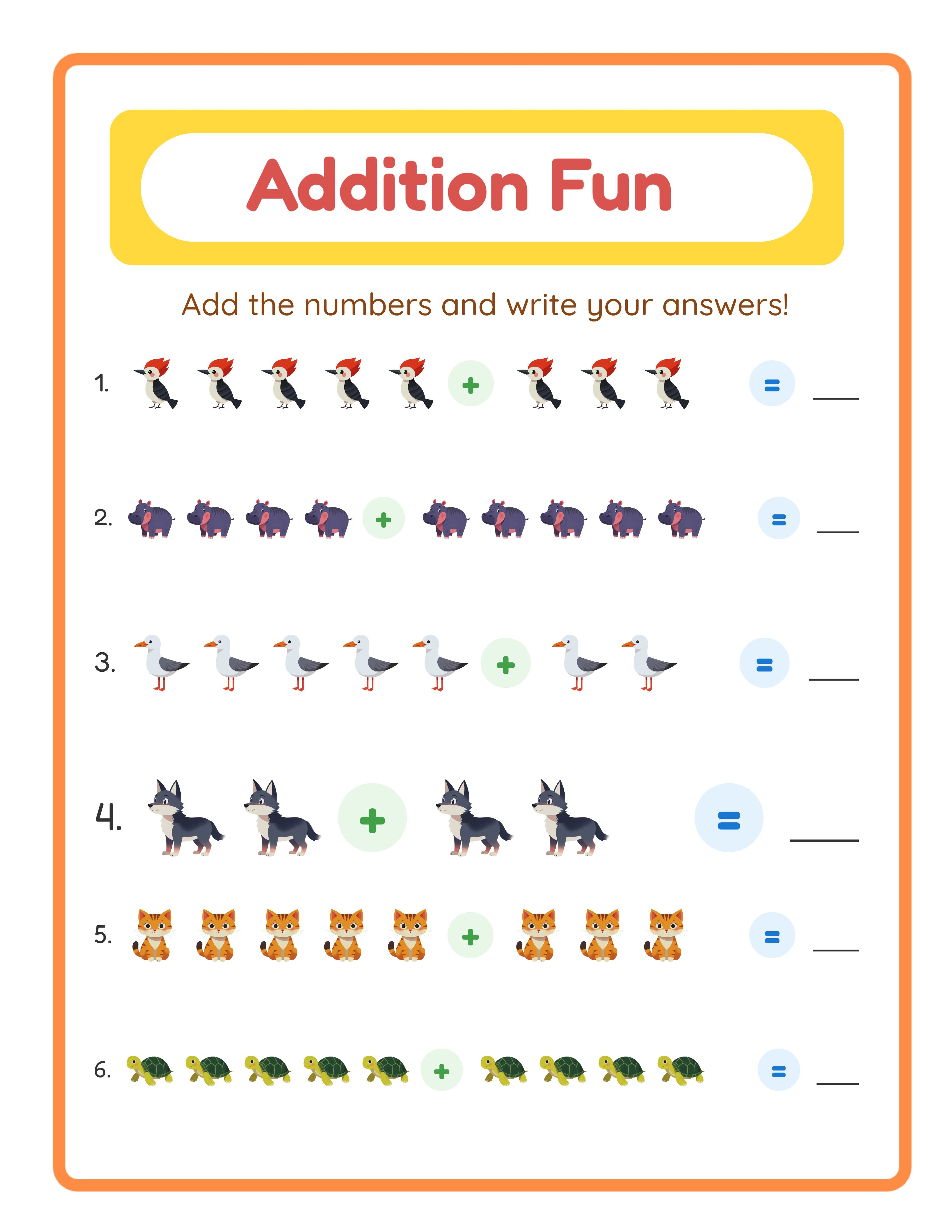
For preschool and kindergarten worksheets (ages 3-6), use a minimum body text size of 18-24 points for instructional text and 28-36 points for content that children will read independently. At this age, children are still learning letter forms, so font selection is critical: use fonts with clear, distinct letterforms that match the letter shapes children are learning. Avoid fonts where the lowercase "a" uses the double-story form (the printed style) if your target audience is learning to write single-story "a" (the handwritten style). Sans-serif fonts like Arial, Verdana, or educational-specific fonts like Sassoon Primary are generally more readable for early readers than serif fonts.
For elementary school worksheets (ages 6-10), minimum body text size should be 14-16 points for instructional text and 16-20 points for user-facing content. Children in this age range can read smaller text but still benefit from generous sizing and clear spacing. Line spacing (leading) should be set to 1.3-1.5 times the font size to prevent lines from appearing crowded. For math worksheets, ensure that numbers are large enough and spaced widely enough for children to write their answers in the provided spaces without cramping.
For upper elementary and middle school worksheets (ages 10-14), body text can be reduced to 11-13 points for instructional text with 1.2-1.4 line spacing. At this level, serif fonts become appropriate for body text as readers are comfortable with standard printed text. However, maintain generous spacing in answer areas and ensure that any handwritten response spaces accommodate typical handwriting size for the age group.
Maintain a strict font hierarchy across your entire product line: one font for headings, one for body text, and optionally one for special elements like page numbers or copyright notices. Using more than three fonts on a single worksheet creates visual chaos that looks unprofessional and reduces readability. The heading font can be more decorative, but body text and instructional text should always use highly readable, clean fonts. Establish your font hierarchy once and apply it consistently to every product in your catalog — this consistency becomes part of your brand identity and allows buyers to immediately recognize your products.
Contrast between text and background is a non-negotiable quality standard. Black or very dark text on white or very light backgrounds provides maximum readability. Light gray text, text over patterned or colored backgrounds, and low-contrast color combinations fail readability standards for printed worksheets. If your design includes colored section backgrounds, ensure text in those sections maintains a minimum contrast ratio that remains readable when printed on lower-quality printers that may wash out subtle color distinctions.
4
Implement Color and Visual Consistency Across Your Product Line
Color and visual consistency establish your brand identity and create a professional appearance that builds buyer confidence. A product line where each worksheet uses different colors, illustration styles, and visual treatments looks like a collection of random products rather than a cohesive professional catalog. Consistent visual standards signal quality and intentional design, which directly influences purchase decisions and justifies premium pricing.
Define a brand color palette of 4-6 colors that you use consistently across all products. Include a primary color (used for headings, borders, and key visual elements), a secondary color (used for accents, highlights, and secondary elements), and 2-4 supporting colors for variety within your palette. Document the exact color values (hex codes or RGB values) so you apply identical colors across every product rather than eyeballing similar shades. Even slight color inconsistencies between products undermine the professional appearance of your catalog when buyers view multiple listings in your shop.
Optimize color usage for home printer output. Colors that appear vivid on screen often print differently on consumer inkjet and laser printers. Highly saturated colors (pure red, bright blue, neon green) tend to print more accurately than subtle or muted tones, which can appear muddy or shift in hue. Large areas of solid dark color consume significant ink, which annoys buyers who are conscious of printing costs. Design worksheets with color used strategically — for borders, headings, icons, and accent elements — rather than large solid color fills. This approach produces better print quality while reducing ink usage, which buyers appreciate and sometimes mention positively in reviews.
Always verify that your worksheets look acceptable when printed in grayscale (black and white). Many buyers print worksheets on black-and-white printers or use grayscale mode to conserve color ink. A worksheet that relies on color to convey information (such as color-coded instructions where red text means one thing and blue text means another) becomes unusable when printed in grayscale. Design worksheets so that all information is accessible without color: use labels, patterns, line styles, or shapes in addition to color to differentiate elements. Test every worksheet by printing it in grayscale mode before listing it for sale.
Maintain a consistent illustration style across your product line. If your worksheets use simple line-art illustrations, do not suddenly include photorealistic images or clip-art in a different style. Visual consistency extends to line weights (the thickness of drawn lines), corner styles (rounded vs. sharp), border designs, and icon sets. Professional worksheet sellers often create or purchase a consistent set of visual assets (icons, decorative elements, border designs) and use them across their entire catalog rather than sourcing different visual elements for each product.
For worksheets where the buyer will print and users will write on the pages, ensure that writing lines, answer boxes, and response areas are clearly defined with sufficient contrast against the background. Answer lines should be a minimum of 0.5 points thick and printed in black or dark gray to remain visible on the printed page. Dotted or dashed writing guides for younger users should use a consistent pattern throughout your product line.
5
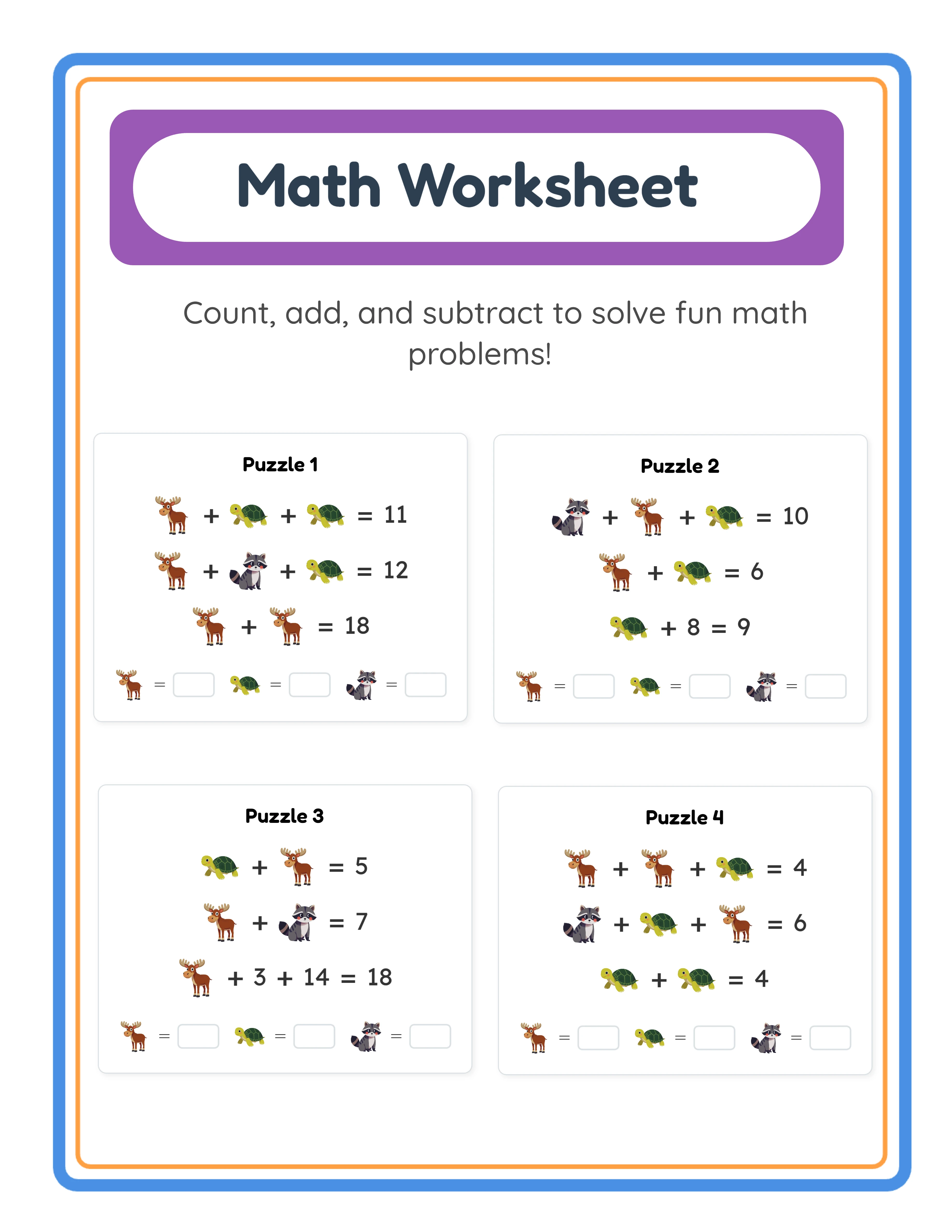
Create an Answer Key Accuracy and Content Verification Process
Answer key accuracy is arguably the highest-stakes quality dimension for educational worksheets. A single incorrect answer in an answer key can generate a negative review that specifically calls out the error, which is the most damaging type of feedback a worksheet seller can receive. Buyers rely on answer keys to check completed work, and an incorrect key means either the buyer marks correct answers as wrong or the error goes undetected and the user learns incorrect information. Neither outcome is acceptable, and buyers have zero tolerance for answer key errors.
Implement a mandatory double-verification process for every answer key. After creating the answer key, wait at least 30 minutes (ideally until the next day), then work through the entire worksheet yourself as if you were a solver, independently solving every problem and comparing your answers to the key. This temporal separation is critical because reviewing an answer key immediately after creating it means you are checking your work with the same mental state that produced it — you are likely to overlook the same errors. Working through the problems fresh provides genuine independent verification.
For math worksheets, verify every calculation independently using a calculator or computation tool, even for problems that seem simple. Mental math errors on basic arithmetic are surprisingly common in answer keys because the worksheet creator is focused on design and layout rather than careful calculation. Addition problems that carry over, subtraction problems that require borrowing, and multi-digit multiplication are particularly error-prone when answer keys are created manually. If your worksheets are generated using a worksheet generator, the answer keys are computed automatically, but still verify a random sample of answers from each generated worksheet to confirm the generation logic is correct.
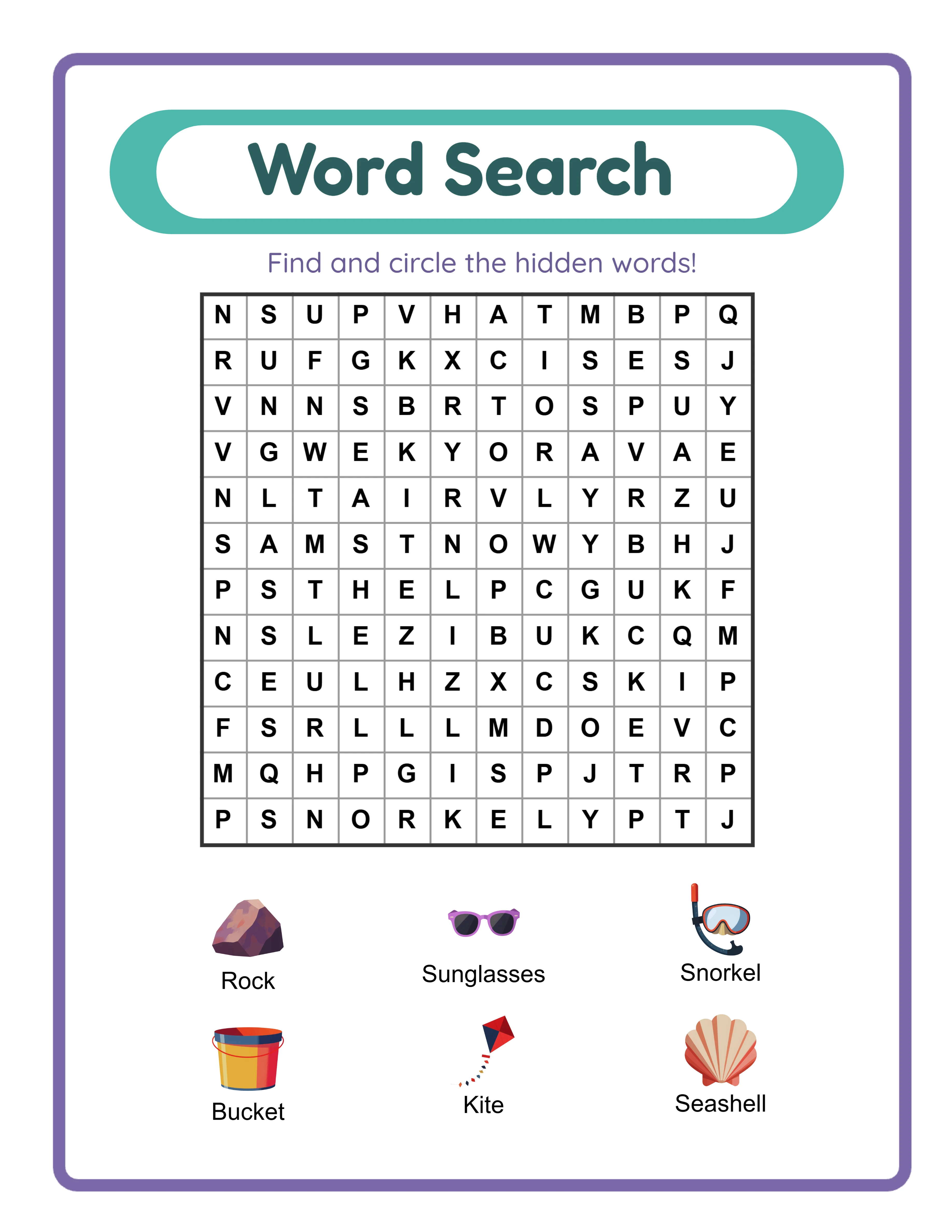
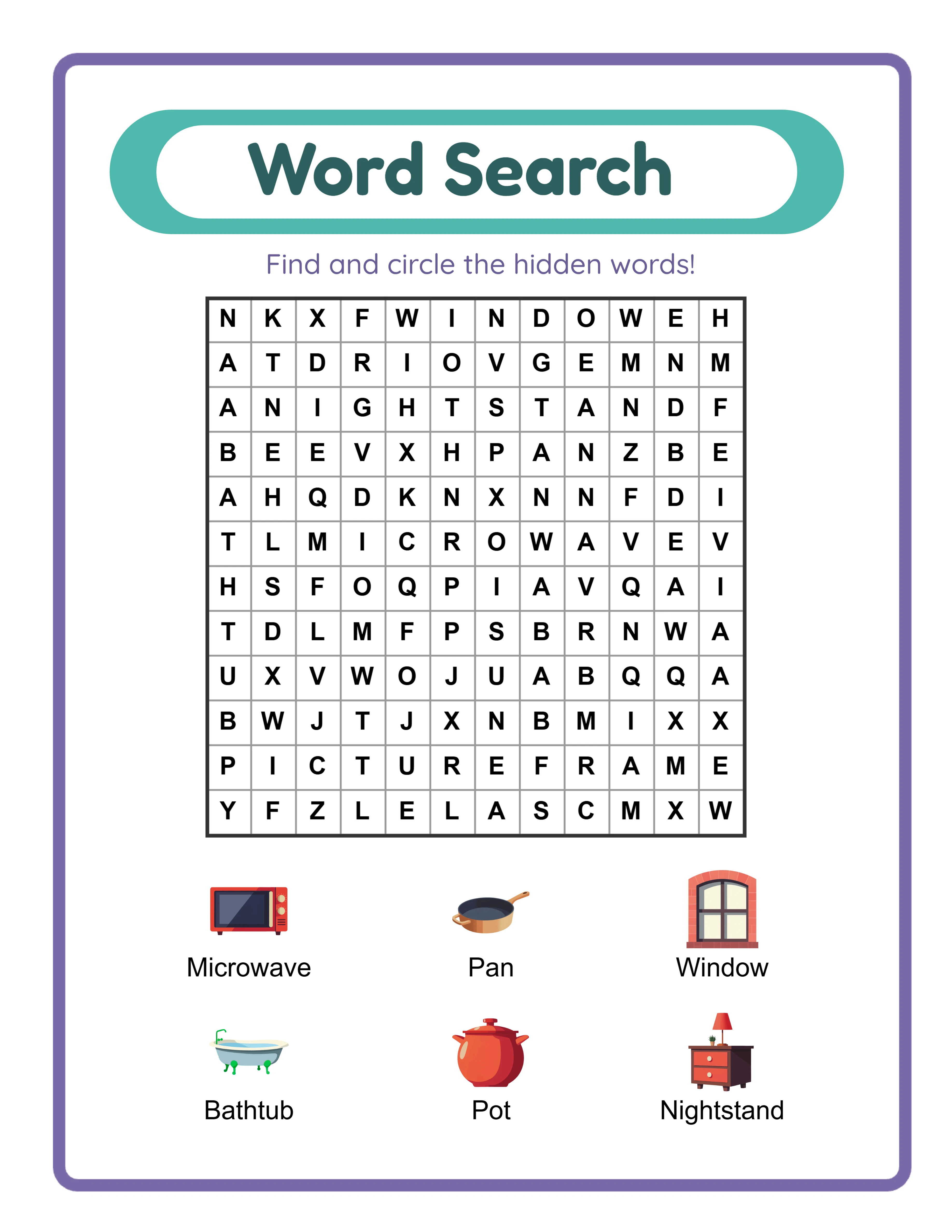
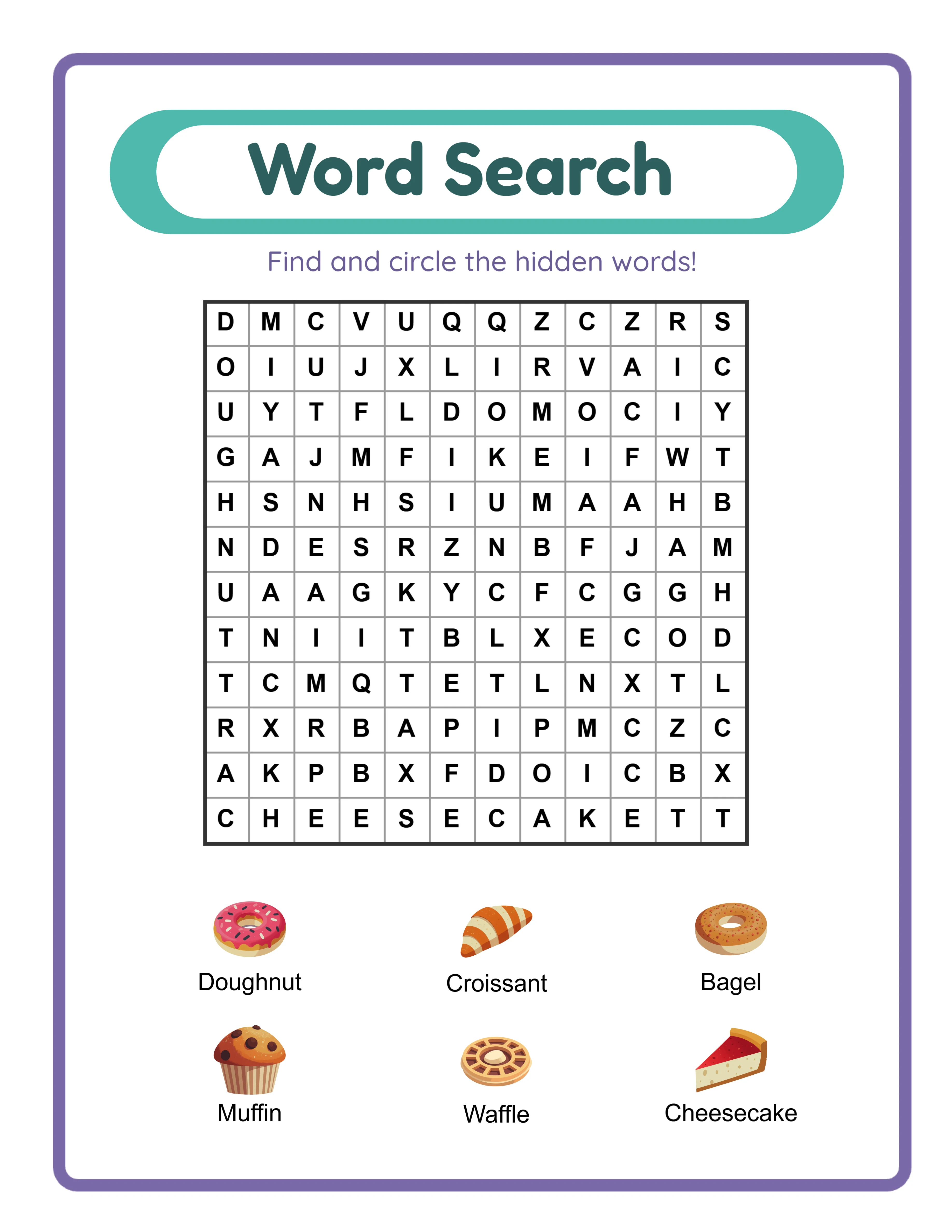
For word-based worksheets (word searches, crossword puzzles, fill-in-the-blank, vocabulary activities), verify spelling accuracy in both the worksheet content and the answer key. Run spell-check on all text content, but do not rely on spell-check alone — it will not catch correctly-spelled words used in the wrong context (their/there/they're) or subject-specific terms not in the spell-checker's dictionary. For word searches specifically, verify that every listed word actually appears in the puzzle grid and can be found along the specified orientation (horizontal, vertical, diagonal).
Verify age-appropriateness and difficulty level for every worksheet before listing. A "first grade math" worksheet that includes multiplication or a "kindergarten reading" worksheet with multi-syllable words will generate complaints and negative reviews even if the answer key is technically correct. Cross-reference your content against grade-level curriculum standards for the targeted age group. If you are unsure about grade-level appropriateness for a specific skill or topic, err on the side of slightly easier rather than slightly harder — a worksheet that feels too easy disappoints less than one that frustrates users and parents.
Document every content verification in a quality log that records the product name, the verification date, who performed the verification, and any issues found and corrected. This log serves two purposes: it creates accountability that ensures verification actually happens for every product, and it provides a reference if a buyer reports a content error — you can quickly determine whether the issue was missed during verification or was introduced after verification during final formatting.
6
Build a Pre-Publication Quality Control Checklist
A pre-publication checklist is the final quality gate between your completed worksheet and the marketplace listing. This checklist should be a documented, step-by-step process that you follow identically for every product, never skipping steps regardless of how confident you feel about a particular worksheet. Quality failures most often occur when sellers bypass their usual process because they are in a rush to list a product or believe a particular worksheet does not need full verification.
Your pre-publication checklist should cover five categories in sequence. First, file verification: confirm the file format is PDF, the resolution is 300 DPI, the page size matches your target (US Letter, A4, or both), and the file size is within marketplace upload limits. Open the PDF in a different application than the one used to create it (for example, if you designed in Canva, open the exported PDF in Adobe Reader or a browser PDF viewer) to verify that fonts render correctly, images display at full quality, and page layout matches your design intent. Font embedding failures are a common PDF export issue where text displays correctly on your computer but shows incorrect fonts on the buyer's device.
Second, print verification: print the entire worksheet on your home printer using standard settings (no scaling, no fit-to-page, standard quality). Examine the printed output for margin accuracy (is any content cut off or too close to the edge?), text readability (can you read all text comfortably at arm's length?), image quality (do images appear sharp with no visible pixelation?), and color accuracy (do colors appear reasonably close to the on-screen version?). If you only have one printer type, print in both color and grayscale to verify the worksheet works in both modes.
Third, content verification: confirm all text content is accurate, complete, and without spelling or grammatical errors. Verify the answer key against the worksheet content. Confirm that instructional text is clear and unambiguous. Verify that the product title, grade level, and subject match the actual content. Check that any page numbers are sequential and correct. Verify that your copyright notice or brand identifier appears on every page.
Fourth, user experience verification: work through the worksheet as a buyer would. Follow the instructions exactly as written to confirm they lead to the correct outcome. Verify that answer spaces are large enough for handwritten responses. Confirm that cutting lines (if applicable) are clearly marked and would produce correctly sized pieces when cut. Check that any interactive PDF elements (clickable links, form fields) function correctly.
Fifth, listing verification: confirm that your listing images accurately represent the actual product. The thumbnail, preview images, and any mockup images should show the current version of the worksheet, not an earlier draft or a different product. Verify that the listing description accurately describes the content, page count, grade level, and included components. Ensure the listing title contains relevant keywords and accurately represents the product.
Create a physical or digital checklist template with checkboxes for each verification step. Complete the checklist for every product and save completed checklists with your product files as documentation. This practice catches quality issues that would otherwise reach buyers and provides evidence of your quality process if disputes arise.
7
Test Print Quality Across Different Printers and Paper Types
Your worksheet will be printed on thousands of different printers in different environments with different settings, and you cannot control any of those variables. The only variable you can control is designing your worksheets to produce acceptable output across the widest possible range of printing conditions. Testing on multiple printer types and with different settings reveals quality issues that testing on a single printer cannot detect.
Test on both inkjet and laser printers if possible. Inkjet printers produce different color output than laser printers — colors tend to be more vivid on inkjet but can bleed slightly on standard paper, while laser output is sharper but colors may appear slightly different. If you only have access to one printer type, ask a friend, family member, or colleague to print a test page on their printer and send you the result, or visit a local print shop to test on their equipment. The goal is verifying that your worksheet produces acceptable quality on both major printer technologies.
Test with different print settings to simulate how buyers will print your worksheets. Many buyers do not adjust print settings and use whatever defaults their printer provides. Print your worksheet at "Normal" quality (not "Best" or "High Quality") to see how it looks under typical conditions. Print at "Draft" quality to see the minimum output quality buyers might experience. If your worksheet looks poor at normal quality settings, the design needs adjustment — heavier line weights, bolder text, higher contrast — to ensure acceptable output even when buyers do not optimize their print settings.
Verify margin handling by printing with the "Actual Size" setting (100% scale, no fit-to-page). Many buyers inadvertently print with "Fit to Page" or "Shrink to Fit" enabled, which scales down the entire worksheet to fit within the printer's maximum printable area. This scaling reduces font sizes, shrinks answer spaces, and can make fine details difficult to read. While you cannot prevent buyers from using these settings, you can design with slightly larger fonts and answer spaces than the absolute minimum, providing a buffer against scaling reduction.
Test on different paper types if your products might be printed on varying media. Standard 20 lb copy paper is the most common printing paper for worksheets. Inkjet output on this paper weight can show slight ink bleed-through on the reverse side, which affects double-sided worksheets. If you offer double-sided printable products, test on standard paper to verify that ink bleed-through does not make the reverse side difficult to read. For worksheets specifically marketed as lamination-ready or for heavy use, test on cardstock (65-110 lb cover stock) to verify that colors and text print acceptably on heavier paper.
Include a brief printing tips section in your product description or as a cover page in your PDF download. Recommend settings that produce the best results: "Print at Actual Size (100%), Normal or Best quality, on standard white paper." This simple addition reduces printing problems, decreases support requests, and demonstrates professional attention to the buyer experience. Many top-rated printable sellers include printing recommendations, and buyers appreciate the guidance, particularly those who are less experienced with printing digital products at home.
8
Maintain Quality Standards as Your Catalog Grows
Quality maintenance becomes increasingly challenging as your catalog expands from 10 products to 50, 100, or more. The quality process that works for individually crafted worksheets does not scale to a large catalog without systematic approaches to consistency, auditing, and updating. Sellers who do not adapt their quality processes to catalog growth eventually experience quality erosion in older products and inconsistency between newer and older items in their shop.
Create master templates that encode your quality standards directly into the design file. A well-constructed template includes pre-set margins, font styles and sizes for each heading level and body text, your brand color palette as saved swatches, consistent spacing between elements, and locked header and footer elements with your brand identity and copyright notice. When every new product starts from a quality-controlled template, the foundational quality standards are automatically applied without requiring manual checks for each element. Update your templates whenever you refine your quality standards, ensuring that all future products meet the current standard.
Schedule quarterly quality audits of your existing catalog. During each audit, randomly select 10-15% of your products and run them through your full pre-publication checklist as if they were new products. This process reveals quality issues that may have been missed during initial publication, identifies products that no longer meet your current (improved) standards, and catches any file corruption or formatting issues that may have occurred during marketplace processing. Document audit findings and schedule corrections for any products that fail current quality standards.
When you update your quality standards — changing your font hierarchy, adjusting margin sizes, updating your brand color palette, or improving your template design — create a prioritized list of existing products that need updating to match the new standards. You do not need to update your entire catalog simultaneously, but you should systematically update products in order of sales volume (highest-selling products first) to ensure your most-visible products always reflect your current quality level. A top-selling worksheet with outdated formatting creates more negative impressions than a rarely-purchased product with the same issue.
Respond to quality-related buyer feedback with immediate corrective action. If a buyer reports a printing issue, an answer key error, or a formatting problem, fix the product immediately and upload the corrected version before doing anything else. Then investigate whether the same issue exists in other products — an answer key error in one worksheet may indicate a systematic issue in other worksheets created during the same period. Send the corrected file to the buyer who reported the issue along with a thank-you message for helping you improve the product. This response pattern converts a negative experience into a positive impression of seller responsiveness.
Maintain version control for your products by including a version number or date in a small footer element on each worksheet. When you update a product, increment the version number. This practice helps you track which version buyers have downloaded, quickly identify whether a reported issue has already been fixed in the current version, and demonstrate to buyers that you actively maintain and improve your products. Version-controlled products signal professional quality management that distinguishes your shop from sellers who list products once and never revisit them.